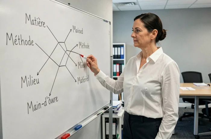
A batch of products comes back from quality control with a recurring defect. The team points to the machine, the supplier, the new operator. Hypotheses abound, but no one structures the search. The 5M method provides exactly this framework: categorizing each possible cause into a specific category to ensure nothing is overlooked and trace back to the source of the problem.
Why the 5M are no longer sufficient as they are in 2026
The classic model is based on five families of causes: Manpower, Material, Equipment, Method, and Environment. This breakdown remains relevant for an initial sorting. It forces the team to explore avenues they might have ignored by reflex.
In recent years, the trend has been to expand the model to six or even seven categories. Management and Measurement have become two additional branches used in industry and services. Management covers strategic choices, quality policy, and hierarchical organization. Measurement concerns indicators, metrology, and the reliability of collected data.
This evolution responds to more instrumented systems, where a poorly calibrated sensor or a vague directive from management can be the real root cause. Limiting oneself to the original five branches sometimes means looking under the wrong streetlight. Before launching your diagram, ask yourself: does your problem involve data-driven management or a managerial decision? If so, add these branches from the start.
For those seeking a detailed explanation of the 5M method in its classic version, the principle remains the same: start from the observed effect, then trace back branch by branch to the causes.
Building an Ishikawa diagram without falling into the catch-all list
The most common trap with the fishbone diagram is filling it out like a shopping list. Each participant sticks a post-it note, and you end up with forty presumed causes without hierarchy. The diagram becomes unreadable, thus useless.

Here’s a sequence that works better in practice:
- Formulate the effect in a measurable sentence. Not “insufficient quality,” but “rejection rate above threshold on line 3 for two weeks.” A vague effect generates vague causes.
- Limit brainstorming to each branch, one by one. First address Material, then Equipment, etc. This sequencing avoids digressions and forces the team to delve into each category before moving on to the next.
- For each primary cause identified, ask the question “why?” at least once. This connects with the 5 Whys method. If “Material – non-compliant resin batch” appears, ask why this batch made it into production. The answer (“incoming control removed due to lack of time”) points to a more actionable secondary cause.
- Eliminate duplicates between branches. A cause related to operator training may appear under Manpower and under Method. Choose the most relevant branch and remove the other.
A useful diagram rarely contains more than fifteen causes, spread across five to seven branches. Beyond that, it’s probably necessary to break the problem down into sub-problems.
Concrete example: analyzing a delivery delay with the 5M
Imagine an e-commerce company that has been experiencing recurring delays in its shipments for a month. The logistics manager gathers their team and draws the diagram.
Manpower: two recently hired order preparers have not completed training on the warehouse management software. They take longer to locate products.
Equipment: the barcode reader at station 2 has been malfunctioning since a software update. Scans fail, and the operator manually re-enters the references.
Method: the picking circuit has not been reviewed since the addition of a new storage area. Preparers are making unnecessary back-and-forth trips.
Material: a packaging supplier changed format without notice. The boxes no longer fit on the automatic sealing line, requiring manual packing.
Environment: the lighting in the new storage area is insufficient, slowing down label reading.
With this diagram, the team identifies three priority causes to address quickly: training for new preparers, fixing the barcode reader, and recalibrating the picking circuit. The causes related to environment and material are real but less impactful, so they take a back seat.
What this example shows about prioritizing causes
The Ishikawa diagram does not prioritize causes by itself. This is its main blind spot. To prioritize, it is necessary to cross the result with another tool. In practice, many teams use a Pareto diagram right after: they measure the impact of each cause (time lost, cost, frequency) and address first those that concentrate the majority of effects.
The Ishikawa diagram identifies, the Pareto diagram prioritizes. Using one without the other leaves the analysis incomplete.
Combining the Ishikawa diagram with other problem analysis tools
Recent publications in quality management emphasize one point: the Ishikawa diagram is increasingly less used alone. It integrates into structured approaches like the 8D method, FMEA, or fault tree analysis.
The most common combination remains the Ishikawa + 5 Whys pair. The diagram serves to map all possible causes. The 5 Whys are then applied to each retained cause to trace back to the root cause. This approach avoids treating a symptom while believing to address the source.
In a project problem-solving context, the sequence often looks like this: define the problem, list the causes with the 5M (or 7M), dig deeper with the 5 Whys, prioritize with Pareto, and then validate the solution with a PDCA action plan.
Have you ever noticed that a “resolved” problem comes back a few months later? This is often a sign that a secondary cause was addressed without reaching the root cause. The true contribution of the 5M method is to force the exhaustiveness of the search, not to provide the final answer. The answer comes from the investigative work that follows the diagram.

A well-constructed Ishikawa diagram fits on a single page, reads in two minutes, and immediately guides action. If yours looks like a ministerial organizational chart, it means the initial problem was too broad. Break it down, start again branch by branch, and keep a simple criterion: each cause listed must be verifiable by an observation or measurement.